By Ben Everett | Sports Editor
On Saturday, Baylor athletics unveiled United, its new partnership with Nike that brings along with it a revised color scheme, new uniforms and a modified logo for each of the Baylor sports teams.
While many of the sports programs used to be under separate contracts with different apparel companies, all programs now fall under one big Nike umbrella. Everyone will have the same Baylor, BU and bear logo along with the same green and gold color scheme.
Here are a few things I like and dislike about the rebranding:
1. The interlocking BU is iconic

The brand new interlocking BU is not just for the sports teams, it’s for the entire university.
My favorite part about the new BU is that they didn’t change much. That logo has been connected to Baylor for as long as I can remember and is easily recognizable.
While Nike added their own little flair to it (the outside border was taken away and little indents were inserted in the B and U), the logo still rings true as the symbol of Baylor University.
2. The new gold color color have been better
This is definitely the worst part about the rebranding. Before this, Baylor didn’t have a specified gold color across the athletic programs, but some used variations of gold to accent the white and green uniforms.
Now, the uniforms use “University Gold,” which is a primary focus in one set of the new football uniforms. I can’t help but feel like this new color is a little too mustard-y and not gold enough.
Using it as an accent on primarily green and white uniforms actually doesn’t look bad. But when it’s the main color, like it is on the football ones, it’s not a good look.
3. The new bear logo is awesome
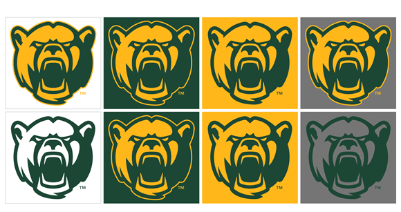
The single best uniform in this new wave of Baylor athletics is the soccer uniforms where the new bear is prominently displayed front and center.
Yeah, “Sailor Bear” is great, and I hope he is used still in throwback uniforms, but this new bear is just awesome.
Jason Cook, vice president for marketing and communications, put it best.
“What’s actually interesting is we have a long string of bears here at Baylor that truly have not become very loved, outside of Sailor Bear of course,” Cook said. “The new bear is quite fierce. He represents the passion that we have here at Baylor.”
4. The new font seems like a generic Nike font
The first new set of uniforms that I saw were the football ones. As soon as I saw them, especially the gold ones, I immediately thought they looked a lot like West Virginia’s gold uniforms. A large part of this is due to the font they use with the numbers.
While it’s most prominent on the football uniforms, mainly because the numbers are the biggest on those, this font can be seen on all the uniforms.
It’s not a bad font, and it’s the same one used for the interlocking BU and Baylor logos, but it just seems a little overused, especially by Nike.
5. The uniforms stayed true to the programs
The worst thing that could’ve happened with this Baylor athletics rebrand is if all the programs wore basically the same uniform. In my opinion, Baylor and Nike did a great job of providing subtle differences to keep the looks unified but still fresh and true to the specific programs.
The best example of this is the men’s basketball volt uniforms. For years, the Bears have been known to wear highlighter colors that make them stand out. Now, their main uniforms will be green, gold and white, but they also have an alternate uniform that incorporates some of their old style.
All in all, I believe the rebrand is a good thing. Baylor was due for a fresh look and the partnership with Nike brought both that and unity to all the sports programs.