By Jonathon S. Platt
Web and social media editor
Notice my byline? It’s different, ain’t it? As of last week, I’m officially serving the Lariat as web and social media editor. And I’m planning to make some serious waves.
In beginning my time as the web-focused voice of the newsroom, I decided to first look back at how far the Lariat has come with our web presence. What follows is my internal evaluation of the previous site designs. In my critiques, I of course mean NO disrespect to previous Lariat web editors. I’m grateful for the previous web masters who paved the way for me to be in this position. My thoughts are not about their abilities or implementation, but comments on the structure of the site from the perspective of someone who consumes and thrives on an aggressively progressive theory of the web. Each generation of our site has been quite modern and generally progressive for its time. From a 2015 perspective, however, lots of them from the early-web world are nauseating.
Currently, the Lariat is ranked as the No. 2 college media website in the nation, according to the College Media Association. We’ve held this esteemed position for two years, and that’s very respectable. However, our editor, Linda Wilkins, did not put me in this position to merely maintain where we are. Wilkins positioned me behind the website wheel to take us to the top. And I fully intend to do so. One of my main goals is that next year at this time, I’ll be writing a post and celebrating victoriously that the Lariat won No. 1 college media website in America.
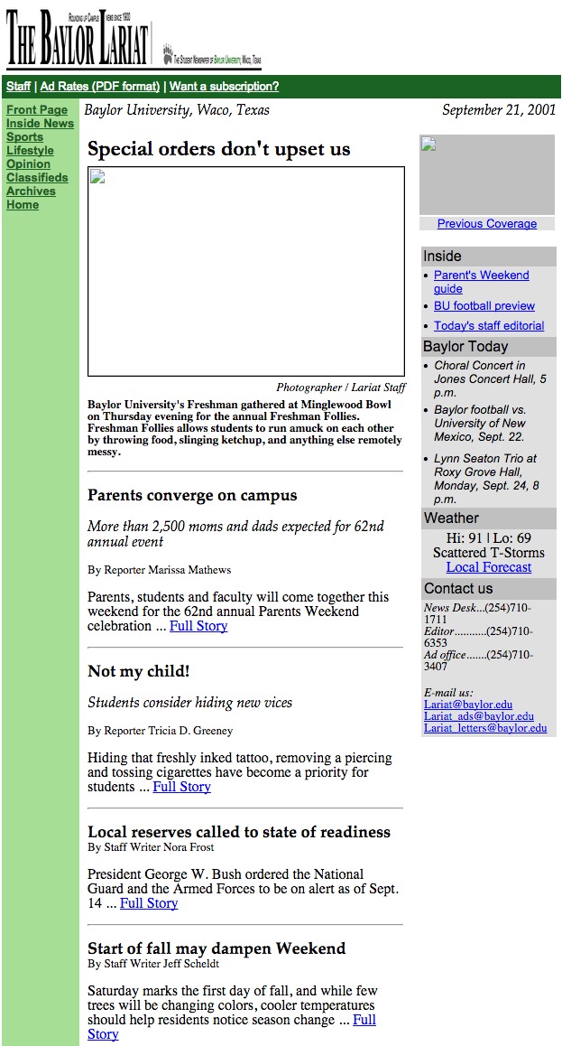
Anyways, back to past. We had meager and slow beginnings, as was common with most corporately-bloated websites in the early 21st Century. There’s a neat archival website called the WayBack Machine, which automatically pulls and saves the code orientation of most websites. It’s been crawling the Lariat’s websites since 2001, when our website looked like this:
WayBack Machine
Then, we were still hosted under the main Baylor web umbrella at baylor.edu/lariat.
In 2002, Baylor purchased the domain you’re reading this on – baylorlariat.com. And it looked like this:
WayBack Machine
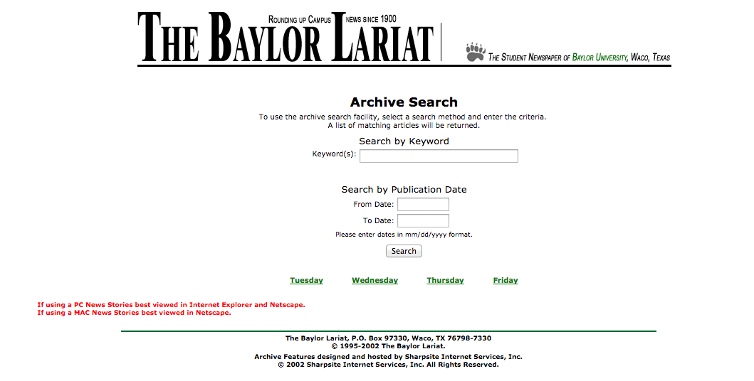
But, in October of that year, the Lariat’s URL was updated to house a basic archive search engine:
WayBack Machine
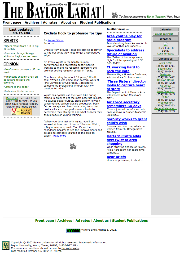
A few updates were made in late 2002 to the Baylor-hosted site:
WayBack Machine
As you can see, changes for this set of tweak included: removal of a the dominant image (something I will never understand the reasoning behind), ditching the green sidebar, a reorientation of the flag logo and an incorporation of those famous dotted lines from early-21st Century web design. I love the incorporation of a sports and opinion section on this redesign and, honestly, it’s relatively one of my favorite looks the Lariat has worn.
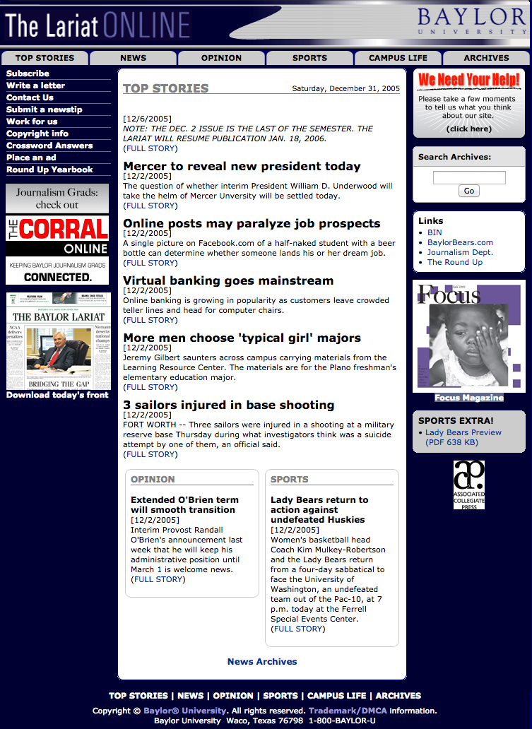
Then, in December 2005, we ruined it. The age of MySpace and heavily colored backgrounds took over and the Lariat donned this horribly awful attire:
WayBack Machine
I honestly have no words for how much I despise the look of this design. Certainly, God bless the designer. It looked great in 2005, but now…ack! Thankfully, this phase didn’t last long.
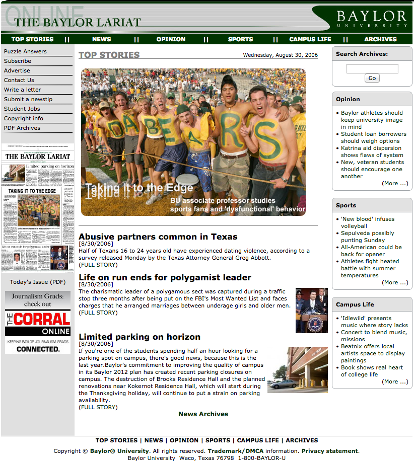
In 2006, the Lariat was still located at baylor.edu/lariat. We got a much-needed, but short-lived, facelift:
WayBack Machine
The designers hath seen the light! The disgusting blue background is gone! Notice on this redesign how similar the layout is to the previous orientation. My favorite addition made in this update is the reincorporation of a featured image. By bringing this piece of art back, it gives the reader a definitive place to look. “This is the most important story,” it says to me. I love seeing more white space, but the header is certainly not my favorite (What the heck is that swoop thing?).
But then – Oy vey! – in 2007, we released the worst rendition of our website. The following was our face for nearly a half decade. Again, oy!
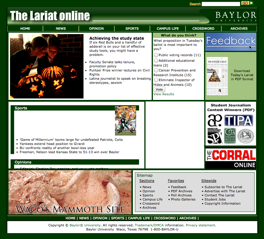
WayBack Machine
We didn’t update the site until it was moved to its own URL in December 2010. In the spring semester of 2011, we officially launched our most expansive redesign. We moved from Baylor’s own CRM to WordPress powered. This, in most of our eyes, was the beginning of the modern era for the Lariat. The redesign came with a rebranding, a new slogan (We’re there when you can’t be), a new color scheme and an attention to our freshly birthed broadcast division. Also included in this theme was our infamous featured slider – more about that in the next post – and the incorporation of Issuu, so readers could easily see our beautifully design and award-winning newspaper. Here’s what we looked like on the dawn of our launch:
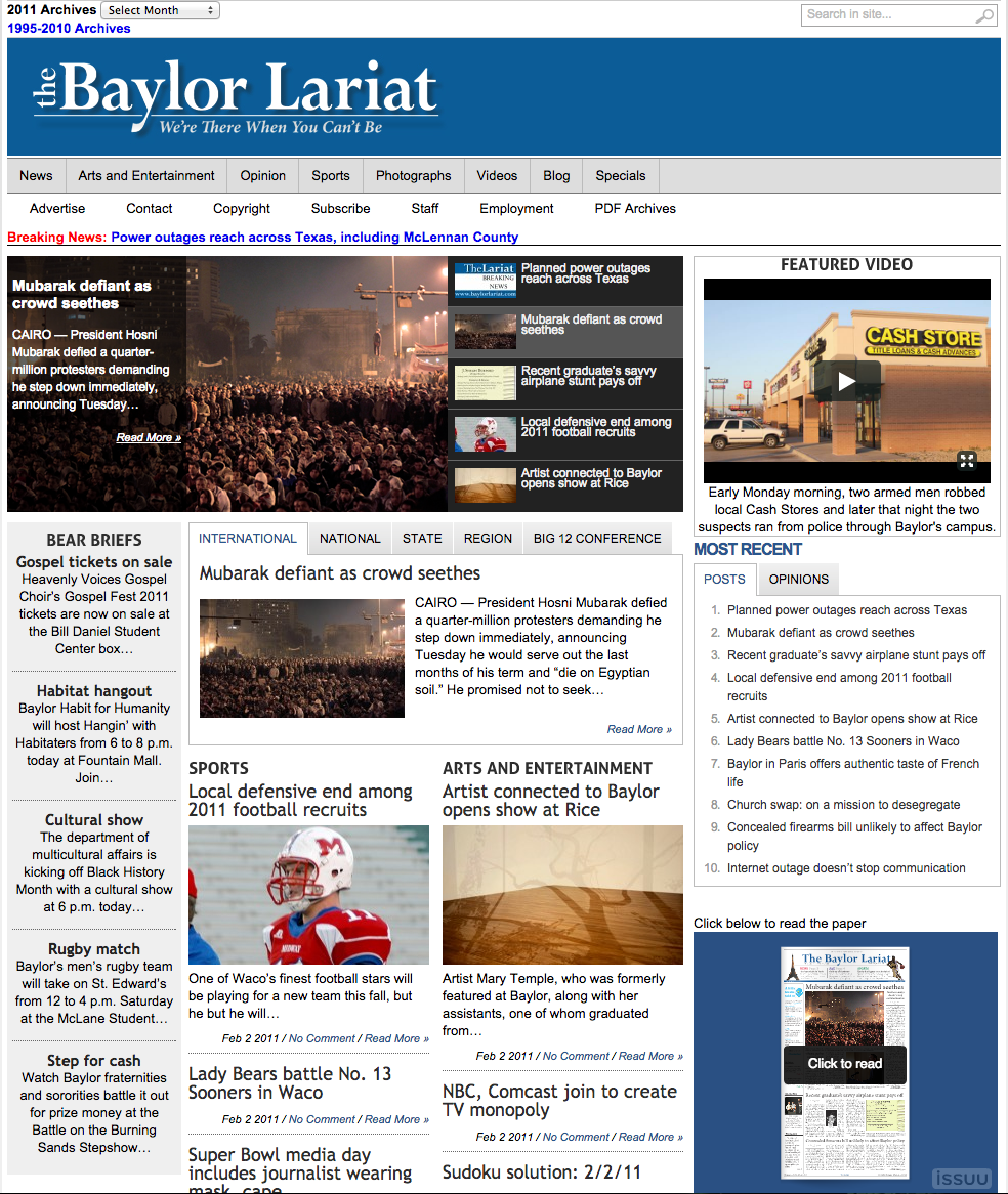
WayBack Machine
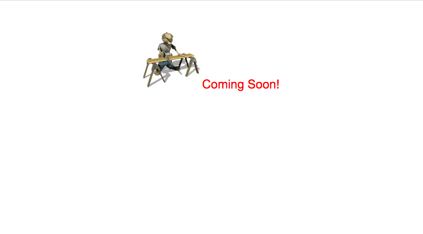
So, as you can see, we’ve come a long way from a cartoon with a saw and sawhorse. But I’ve got dreams of taking us further than any previous web editor has. To see what I’ve done so far with this new position, make sure to check out my post next week over our current site and what the future holds for the Lariat’s online presence. I’m excited to give you a peak. We’ve got some awesome stuff in the pipeline.