By Emily Cousins | Staff Writer
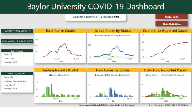
The Baylor University COVID-19 Dashboard was updated Sept. 23, which led to questions about miscounts and an adjusted positivity rate.
Before the update, week one on the dashboard had 92 more cases than are listed now. Jason Cook, vice president for marketing and communications and chief marketing officer, said these cases were duplicates.
“We had a large number of unclassifieds as a result of the pre-semester testing program,” Cook said. “In other words, we were unsure if these were student, faculty or staff test results. As part of the review, we learned that these 92 tests … had been categorized as both “unclassified” and “student.” They were being counted twice. As part of the review, we were able to reconcile these tests as student test results. There are no longer any unclassified tests now that the review is complete.”
In a Presidential Perspective sent out on Sept. 24, President Linda Livingstone discussed the update of the dashboard.
“We have added two new graphs and segmented cases by students, faculty, staff and contractors. We have also simplified our positivity rate reporting in accordance with CDC guidelines,” Livingstone said.
The positivity rate is now a combination of the clinical rate and surveillance rate to better represent how COVID-19 is affecting Baylor, Cook said.
“We had already been in discussions with the county public health department to ensure that we are reporting data to them that is in line with CDC guidelines,” Cook said. “That resulted in the collapsing of the data into a total number of cases, tests and positivity rate. It truly simplified the data for the campus community, as well as for our healthcare partners.”
Health Planner and Public Information Officer Kelly Craine said when McLennan County first organized their COVID-19 dashboard, they had to figure out the best way to communicate the most accurate and up-to-date information to the public.
“Usually, testing is not reported. People get tested all the time for different things. We only receive the positive reports. Because there was a shortage of testing in the beginning, we had to find a way to let people know how much testing was being done in our county,” Craine said.
Over time, dashboards for COVID-19 are being updated to be more clear and helpful to the community they are serving. At Baylor, Cook said the dashboard now includes clarification on who has tested positive.
“This review process has allowed us to report specific student, faculty, staff and contractor data numbers, which were added to the Dashboard last week,” Cook said. “We believe this breakdown provides much more clarity for the campus community.”


