By AnnaGrace Hale | Sports Writer
On Thursday, Sept. 15, I woke up, checked my phone and was disappointed.
After weeks of anticipation, Nike finally dropped the 2022 U.S. Soccer Uniform collection at 3:15 a.m. EST. Why would they release a highly expected line in the middle of the night you may ask? Because they were ashamed, and rightfully so. These kits are simply a letdown.

Maybe Nike hoped fewer fans would see these atrocities if they were unveiled when U.S. soccer supporters were dead asleep. But, in the long run, it doesn’t matter. The jerseys will be seen on the world stage soon enough.
These horrors will be worn by the U.S. Men’s National Team for the 2022 FIFA World Cup in Qatar this winter. Additionally, the U.S. Women’s National Team will be sporting the red, white and blue Down Under for the 2023 FIFA Women’s World Cup this summer. They are here to stay.
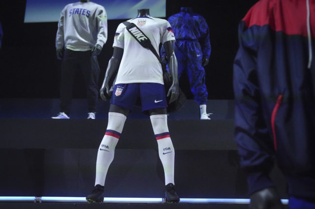
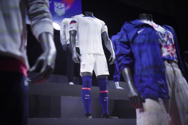
The jersey duo is composed of a predominantly white jersey with red and blue accents on the sleeves. Hoping to connect to other American sports like football, Nike placed the Nike swoosh on the sleeves. This design is pretty much the same as any middle school soccer jersey I have ever seen.
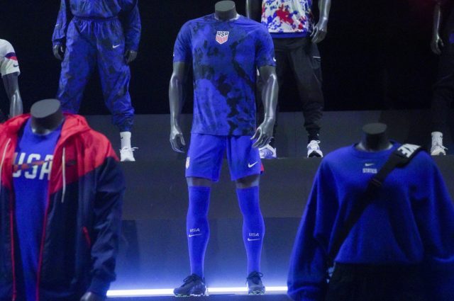
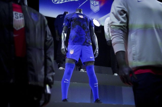
The blue and black tie-dye secondary jersey is much, much worse. The print gives me visions of summer afternoons spent at grandma’s house — but not pleasant ones.
Picture this: you are bored, and your grandmother pulls out a tie-dye kit from the craft closet that is over ten years old. You then proceed to wrap up your least favorite shirt in rubber bands and go absolutely ham with the blue dye. After hours of waiting, you unwrap your creation to reveal a shirt that simply doesn’t look good at all. You toss it in your drawer and deem it a sleep shirt.

That is what this jersey is.
I wish the redeeming quality was the shorts, but the blues clash. The tie-dye simply does not match.
Don’t even get me started on the crest placement. I have no idea who thought the middle of the chest was a good idea, but it looks awful. It seems unprofessional and the designers obviously did not take into account the women’s squad when making this decision.
After winning the Women’s World Cup in 2019, the USWNT has the privilege of wearing jerseys with gold FIFA crests. Due to the U.S. shield situation in the center of the chest, the crest had to be placed to the side, and the reigning world champions are left to look silly.
It is plain and simple. The designers lacked creativity and commitment to these kits. Nike is capable of making impressive jerseys, as shown by other designs, but they seemed to throw together this pairing in a matter of minutes. I was in awe of Nigeria’s kits, ones that will not even be seen on a World Cup pitch. England’s weren’t all that bad either.

U.S. fans have gone crazy with backlash and some have even created their own jersey designs, showing the great potential that was missed. Some players on the USMNT team have displayed their disapproval as midfielder Weston McKennie exhibited on Instagram.
Despite the attempt to create unity among the nation, this release may have caused more division.
Overall, one good thing came from this kit drop. Last year’s jerseys have hit the sale racks and are now in my price range.


